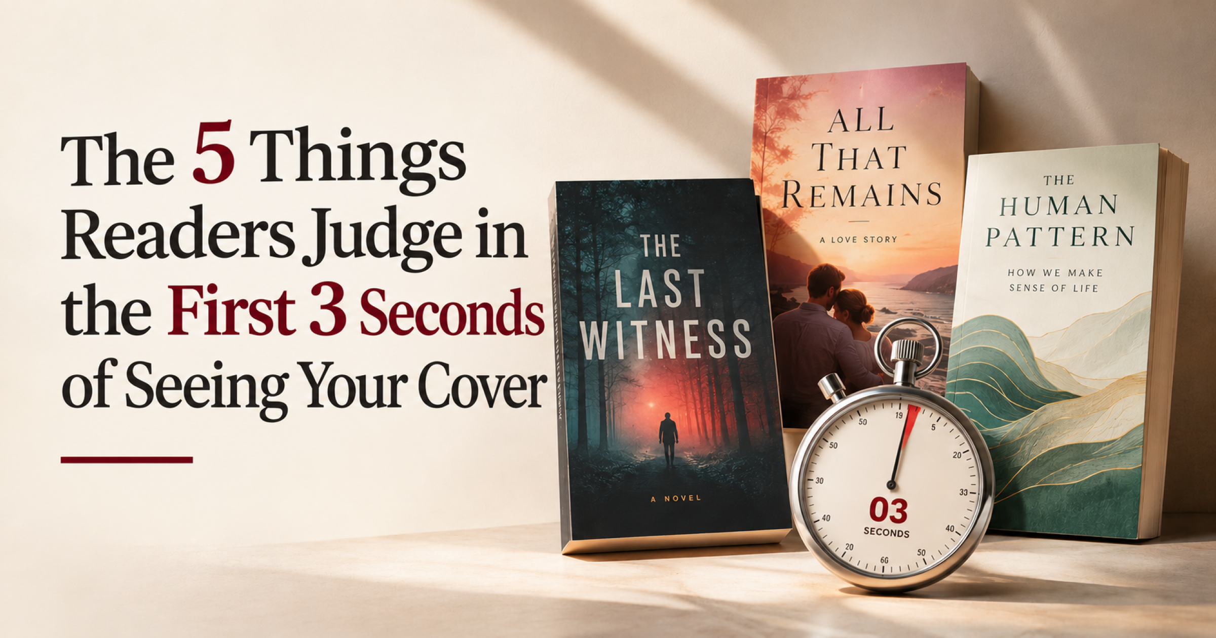

Readers judge a book by its cover in seconds, before they tap through or scroll past on Amazon. In that window, they make five separate judgements, none of them conscious and all of them decisive. Here is what those judgements are, in the order they happen, and what our cover designers do to win each one.
What do readers judge when they judge a book by its cover?
When readers judge a book by its cover, they judge five things at a glance: whether the thumbnail is legible, whether the cover fits its genre, whether the title can be read quickly, what the colour palette signals, and whether the book looks professionally produced. Most of this happens before the reader has consciously looked at the artwork. A cover that passes all five earns a click on the book page. A cover that fails even one, usually the first, is skipped without the reader knowing why. A note on the number: “three seconds” is a widely repeated rule of thumb in publishing, not a figure from one definitive study. Other sources quote two, seven or fifteen seconds. The point holds whichever you pick: readers judge a book by its cover fast, and on the image alone. Every design choice below is aimed at that first glance.
1. Thumbnail legibility: the design-for-size-first rule
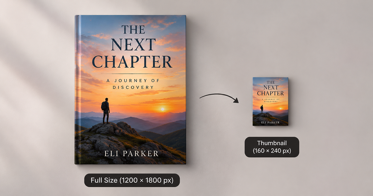
Thumbnail legibility is the first test whenever readers judge a book by its cover: can they see what the cover is showing at the size they are viewing it? On Amazon, search and browse thumbnails are typically only about 100 to 160 pixels tall, and on a phone screen with reduced brightness they feel smaller still. The rule every one of our designers works to: design the cover at full size, then immediately reduce it to 300 pixels wide and look at it, then again at roughly 160 pixels tall. If the central image is unclear, if the title is unreadable, if the composition has dissolved into visual noise, the cover has failed at step one. Fix the thumbnail first. The full-size cover will look after itself. This seems obvious. It is violated on roughly 60% of self-published covers we see. The reason is human: designers work at full size because full size looks good. The discipline of shrinking the canvas and asking “does this still work?” has to be deliberately imposed, because a reader’s first moments with your cover are lived at thumbnail size. Two habits cause most failures. Busy artwork with several focal points turns muddy when shrunk, and mid-tone colours blend into Amazon’s grey interface. One clear focal point and a strong light-dark contrast survive the squeeze. For upload, Amazon KDP recommends an ebook cover of 2,560 pixels tall by 1,600 pixels wide (a 1.6:1 ratio), so you always have a sharp master to shrink from.2. Genre fit: the contract before the contract
Genre fit means the cover looks like the books its readers already buy, and readers judge it in under a second. The proverb says not to judge a book by its cover, but in a crowded category every reader does. Readers of genre fiction (romance, thriller, fantasy, crime) have absorbed thousands of covers in their preferred category. They know what a thriller cover looks like. They know what a cosy mystery looks like. They know what a literary memoir looks like. When a cover violates those conventions, they distrust it, not because the cover is bad, but because the mismatch suggests the book may not be what they are looking for. This is the most common mistake serious writers make with their covers. The temptation is to stand out from the genre with a different palette, a different composition, a design choice that is artistically interesting but commercially foreign. The result is a cover that repels exactly the readers who would enjoy the book. Genre conventions are not a creative prison. They are a set of signals. Work within them first, then find the one element (a colour accent, a typographic choice, a compositional angle) that makes your cover distinctively itself while still signalling its genre correctly. A practical test: put your thumbnail in a row with the current top ten in your Amazon category. Does it look like it belongs? Better still, show it to five readers for three seconds and ask them to name the genre. If they cannot, the cover is not yet doing its job.3. Title readability: the one-second test
A title is readable when you can take it in at arm’s length in under a second, well inside the short window readers give a cover. If you cannot, it is not a legibility problem. It is a hierarchy problem: something on the cover is competing with the title for visual priority and winning. The fix is almost always contrast and scale, not font choice. A title in a moderate typeface at 300% scale with strong contrast against the background will beat an elaborately chosen custom font at 120% scale with low contrast every time. Authors often want to use the decorative, genre-appropriate script font throughout the cover. Our designers use it for accents and let a clean, high-contrast font carry the title. Thin, soft or heavily ornamented letterforms are the first to blur at thumbnail size. Readers who judge a book by its cover never zoom in to decode a title, so it has to read on its own.4. Colour as genre and mood signal
Colour is the fastest signal a cover sends because it is processed before the reader’s brain has finished parsing the shapes. When readers judge a book by its cover, palette is the first thing they register. Dark palette with red accents: thriller, crime, horror. Pale palette with warm tones: romance, women’s fiction, memoir. Bright primaries: children’s books, humour, cookbooks. Cool blues and blacks: business, technology, self-help. If you are writing for young readers, our guide to children’s book word counts covers how long the text usually runs, which is worth knowing before you brief a cover. This does not mean every thriller must be black and red. It means that when you deviate from genre palette conventions, you need a strong reason and a stronger execution. The deviation has to be obviously intentional, not a default that the designer landed on because it looked nice.5. Perceived production quality: the professional signal
When readers judge a book by its cover, professional quality is the final judgement, usually made in the third second and sometimes not consciously made at all, and it is almost entirely about spacing, margin, and typographic precision. Specifically: is there breathing room around the title? Is the author name appropriately sized relative to the title (the hierarchy is correct, not competing)? Are the font choices consistent and non-conflicting? Is the bottom third of the cover, where the author name and publisher imprint sit, treated with the same care as the top? Readers cannot articulate why a cover looks amateur. They just know it does. The signal is almost always in the details: text too close to the edge, two typefaces that are similar but not identical, an author name that is either too large (ego) or too small (afterthought). These are the differences between a cover that closes the sale and one that loses it, because readers judge a book by its cover long before they read a page. This matters even more if you plan to use the book to build authority. Our piece on a book as a business card shows why a polished cover is part of that first impression.How can you test your cover before readers do?
To judge a book by its cover the way a browsing reader does, run this five-minute test, using only the cover file and a phone.- Shrink the cover to about 160 pixels tall and check that the title and focal image still read.
- Place it beside ten bestsellers in your category and see whether it looks like it belongs.
- Show it to five readers for three seconds and ask them to name the genre and the title.
- View it in greyscale to confirm the title contrast holds without colour.
- Check the margins: nothing important should sit near the edge, and the author name should be clearly secondary to the title.